Home
Design
Art
About
Rebranding initiative to modernise digital presence while maintaining accessibility and clarity
Live site: https://designtobias.com/

Challenge
Tobias required a comprehensive brand transformation to strengthen its market presence, and attract both clients and creative talent. The goal was to create a visually engaging, accessible digital identity aligned with their design-led values while ensuring scalability and ease of content management through a flexible CMS.
Approach
We developed a strategic design foundation focused on accessibility, usability, and brand clarity.
This involved:
- Building a flexible design system in Figma to ensure visual consistency across web, print, and CRM channels
- Designing a responsive, WCAG-compliant website experience with strong typographic hierarchy
- Collaborating with developers to implement CMS-compatible templates for scalability
Throughout, we prioritised inclusive design thinking and, a cohesive user experience across all digital touch points.

Outcome
The rebrand strengthened Tobias’ digital presence and supported its growth strategy by delivering a unified visual identity and scalable digital infrastructure.
- 70% growth in CRM and outreach marketing programs
- Positioned Tobias as a modern design-led studio while preserving its integrity and values
- Delivered a fully responsive website interface that met accessibility standards
- Developed a CMS-integrated design system enabling ongoing content updates and marketing campaigns
- Extended the brand consistently across print, web, and CRM channels, from white papers to sign-up forms
- Created reusable design assets and templates to support future internal communications and campaign rollouts
Older version of the website, visual design and information architecture
Information archetecture and content sturecture
home page wireframes for web and mobile screens
In research it was discovered that customers, clients wanted to know more about the people working at Tobias. Staff desired to have their own page as well. People from Tobias can choose their favourite colour for the hero banner image, with their photo, their initials in the background, job title and a nickname. Everyone can also pick their design superpower along with a personal story about them. We wanted our team to own their own pages.
Published Figma components, libraries
Information archetecture and content sturecture
Examples of Responsive screens
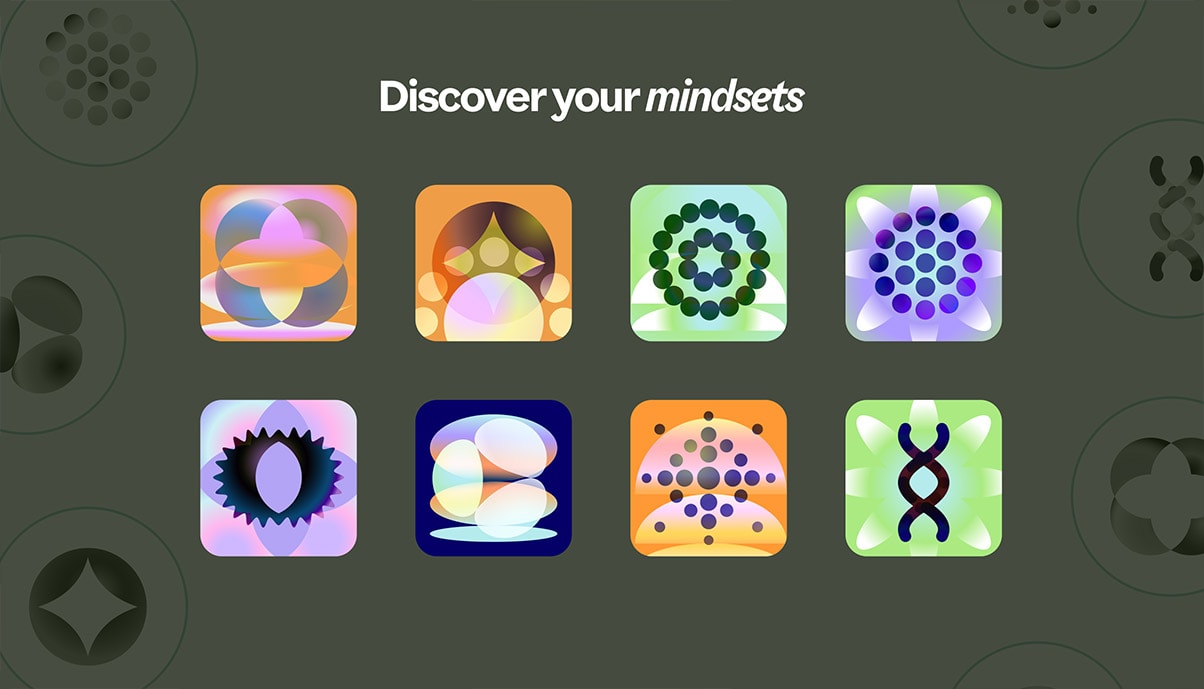
Custom icons were designed and animated to communicate the areas of specialisation which were: Strategic, Finance, Innovation, Ways of working, Human-Centred Digital Transformation, Government, Health, and Social Innovation.
Step by step exploration of the logotype to monograms
The core concept was to imagine visual cues which were taken from the existing logotype. Individual letters were improvised into abstract forms. These forms were put together to create monograms which were assigned to core service brackets (Discover, Define, Design, Engage, Learn & Uplift)
Information archetecture and content sturecture
We created a comprehensive colour palette with a wide range of hues and shades, ensuring all of them met or exceeded WCAG standards. This meant prioritising legibility and clarity across all digital touchpoints.
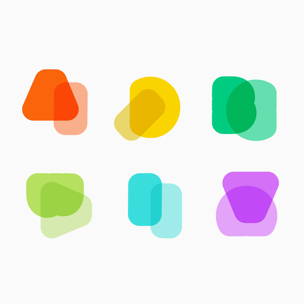
Comprehensive illustration assets
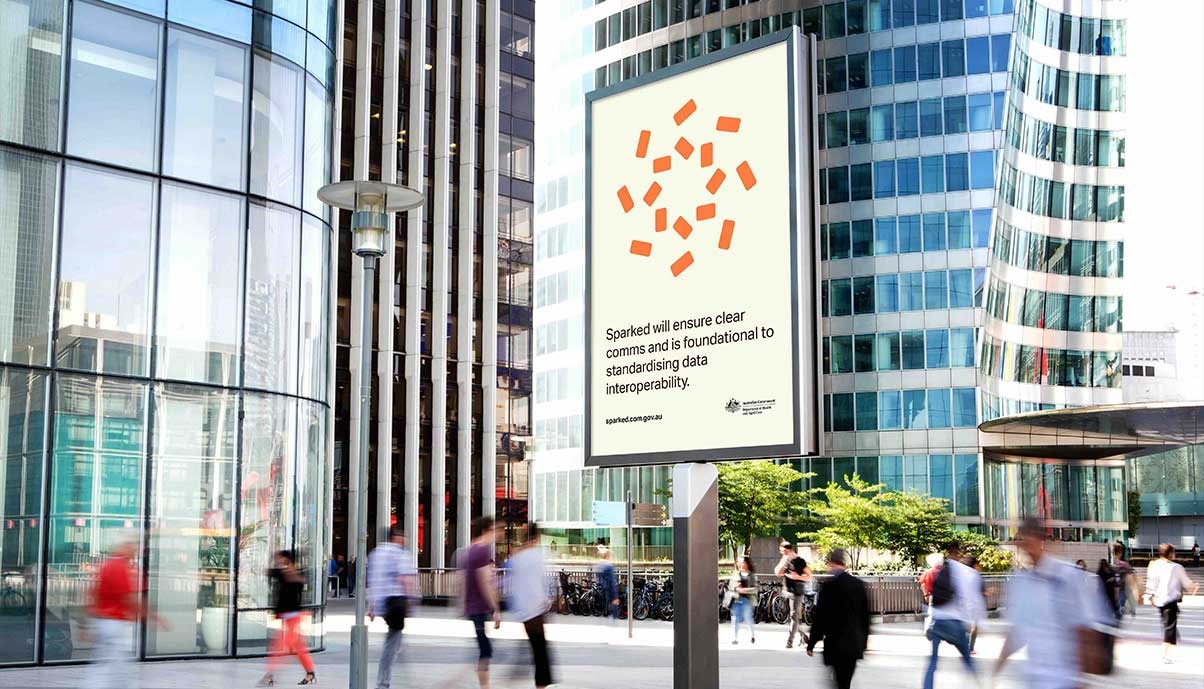
Examples of how we have used the grid, type and design system on white papers. Maintained consistency while expanding by using the same colours, layout style, design elements like boxes, outlines etc.

Other Projects
See Project
→
See Project
→
See Project
→
Let’s have a chat!
CONTACT
girivarshan.work@gmail.com
+61 468 469 067
SOCIAL
© 2026 Girivarshan Balasubramanian. All rights reserved.
Home
Design
Art
About
Rebranding initiative to modernise digital presence while maintaining accessibility and clarity
Live site: https://designtobias.com/
Challenge
Tobias required a comprehensive brand transformation to strengthen its market presence, and attract both clients and creative talent. The goal was to create a visually engaging, accessible digital identity aligned with their design-led values while ensuring scalability and ease of content management through a flexible CMS.
Approach
We developed a strategic design foundation focused on accessibility, usability, and brand clarity.
This involved:
- Building a flexible design system in Figma to ensure visual consistency across web, print, and CRM channels
- Designing a responsive, WCAG-compliant website experience with strong typographic hierarchy
- Collaborating with developers to implement CMS-compatible templates for scalability
Throughout, we prioritised inclusive design thinking and, a cohesive user experience across all digital touch points.
Outcome
The rebrand strengthened Tobias’ digital presence and supported its growth strategy by delivering a unified visual identity and scalable digital infrastructure.
- 70% growth in CRM and outreach marketing programs
- Positioned Tobias as a modern design-led studio while preserving its integrity and values
- Delivered a fully responsive website interface that met accessibility standards
- Developed a CMS-integrated design system enabling ongoing content updates and marketing campaigns
- Extended the brand consistently across print, web, and CRM channels, from white papers to sign-up forms
- Created reusable design assets and templates to support future internal communications and campaign rollouts
Older version of the website, visual design and information architecture
Information archetecture and content sturecture
home page wireframes for web and mobile screens
In research it was discovered that customers, clients wanted to know more about the people working at Tobias. Staff desired to have their own page as well. People from Tobias can choose their favourite colour for the hero banner image, with their photo, their initials in the background, job title and a nickname. Everyone can also pick their design superpower along with a personal story about them. We wanted our team to own their own pages.
Comprehensive illustration assets
Information archetecture and content sturecture
Examples of Responsive screens
Custom icons were designed and animated to communicate the areas of specialisation which were: Strategic, Finance, Innovation, Ways of working, Human-Centred Digital Transformation, Government, Health, and Social Innovation.
The core concept was to imagine visual cues which were taken from the existing logotype. Individual letters were improvised into abstract forms. These forms were put together to create monograms which were assigned to core service brackets (Discover, Define, Design, Engage, Learn & Uplift)
Step by step exploration of the logotype to monograms
Information archetecture and content sturecture
Examples of Responsive screens
Comprehensive illustration assets
Examples of how we have used the grid, type and design system on white papers. Maintained consistency while expanding by using the same colours, layout style, design elements like boxes, outlines etc.
Other Projects
See Project
→
See Project
→
See Project
→
Let’s work together
CONTACT
girivarshan.work@gmail.com
+61 468 469 067
SOCIAL
© 2026 Girivarshan Balasubramanian. All rights reserved.
Home
Design
Art
About
Rebranding initiative to modernise digital presence while maintaining accessibility and clarity
Live site: https://designtobias.com/
Challenge
Tobias required a comprehensive brand transformation to strengthen its market presence, and attract both clients and creative talent. The goal was to create a visually engaging, accessible digital identity aligned with their design-led values while ensuring scalability and ease of content management through a flexible CMS.
Approach
We developed a strategic design foundation focused on accessibility, usability, and brand clarity.
This involved:
- Building a flexible design system in Figma to ensure visual consistency across web, print, and CRM channels
- Designing a responsive, WCAG-compliant website experience with strong typographic hierarchy
- Collaborating with developers to implement CMS-compatible templates for scalability
Throughout, we prioritised inclusive design thinking and, a cohesive user experience across all digital touch points.
Outcome
The rebrand strengthened Tobias’ digital presence and supported its growth strategy by delivering a unified visual identity and scalable digital infrastructure.
- 70% growth in CRM and outreach marketing programs
- Positioned Tobias as a modern design-led studio while preserving its integrity and values
- Delivered a fully responsive website interface that met accessibility standards
- Developed a CMS-integrated design system enabling ongoing content updates and marketing campaigns
- Extended the brand consistently across print, web, and CRM channels, from white papers to sign-up forms
- Created reusable design assets and templates to support future internal communications and campaign rollouts
Older version of the website, visual design and information architecture
Information architecture and content mapping
Home page wireframes for web and mobile screens
In research it was discovered that customers, clients wanted to know more about the people working at Tobias. Staff desired to have their own page as well. People from Tobias can choose their favourite colour for the hero banner image, with their photo, their initials in the background, job title and a nickname. Everyone can also pick their design superpower along with a personal story about them. We wanted our team to own their own pages.
Published Figma components, libraries
Examples of accordions and services grids for web and mobile
Examples of Responsive screens
Custom icons were designed and animated to communicate the areas of specialisation which were: Strategic, Finance, Innovation, Ways of working, Human-Centred Digital Transformation, Government, Health, and Social Innovation.
The core concept was to imagine visual cues which were taken from the existing logotype. Individual letters were improvised into abstract forms. These forms were put together to create monograms which were assigned to core service brackets (Discover, Define, Design, Engage, Learn & Uplift)
Step by step exploration of the logotype to monograms.
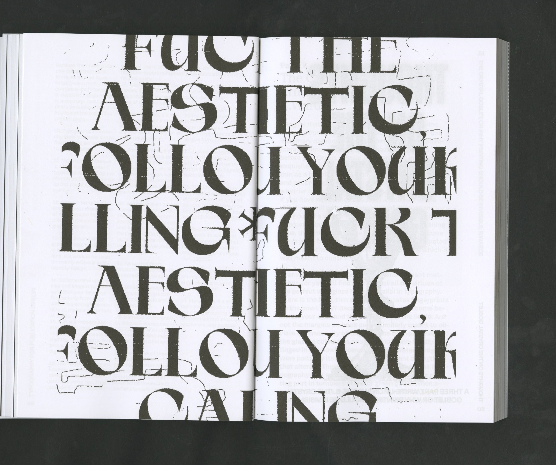
We chose Söhne, a typeface from Klim Type Foundry in Wellington, New Zealand, for its perfect balance of readability and distinct character. Its refined, modern structure ensures clarity and accessibility across both print and digital media, while its subtle personality captures TOBIAS’s tone - professional, confident, and approachable.
We created a comprehensive colour palette with a wide range of hues and shades, ensuring all of them met or exceeded WCAG standards. This meant prioritising legibility and clarity across all digital touchpoints.
Comprehensive illustration assets
Examples of how grid, type and design system were used various artefacts. Maintaining consistency while expanding by using the same colours, layout style and design elements like containers, icons etc.
Other Projects
See Project
→
See Project
→
See Project
→
Let’s work together
CONTACT
girivarshan.work@gmail.com
+61 468 469 067
SOCIAL
© 2026 Girivarshan Balasubramanian. All rights reserved.